I’ve realised that now I am no longer using Twitter, there is no systematic overview of all the flow diagrams I have made over the years. So this is a post looking back over all the things I have diagrammed, and why! Please click on any image below to load a high resolution PNG version. Links to folders with XML, calculations, and high resolution PNGs and PDFs are provided in each case.
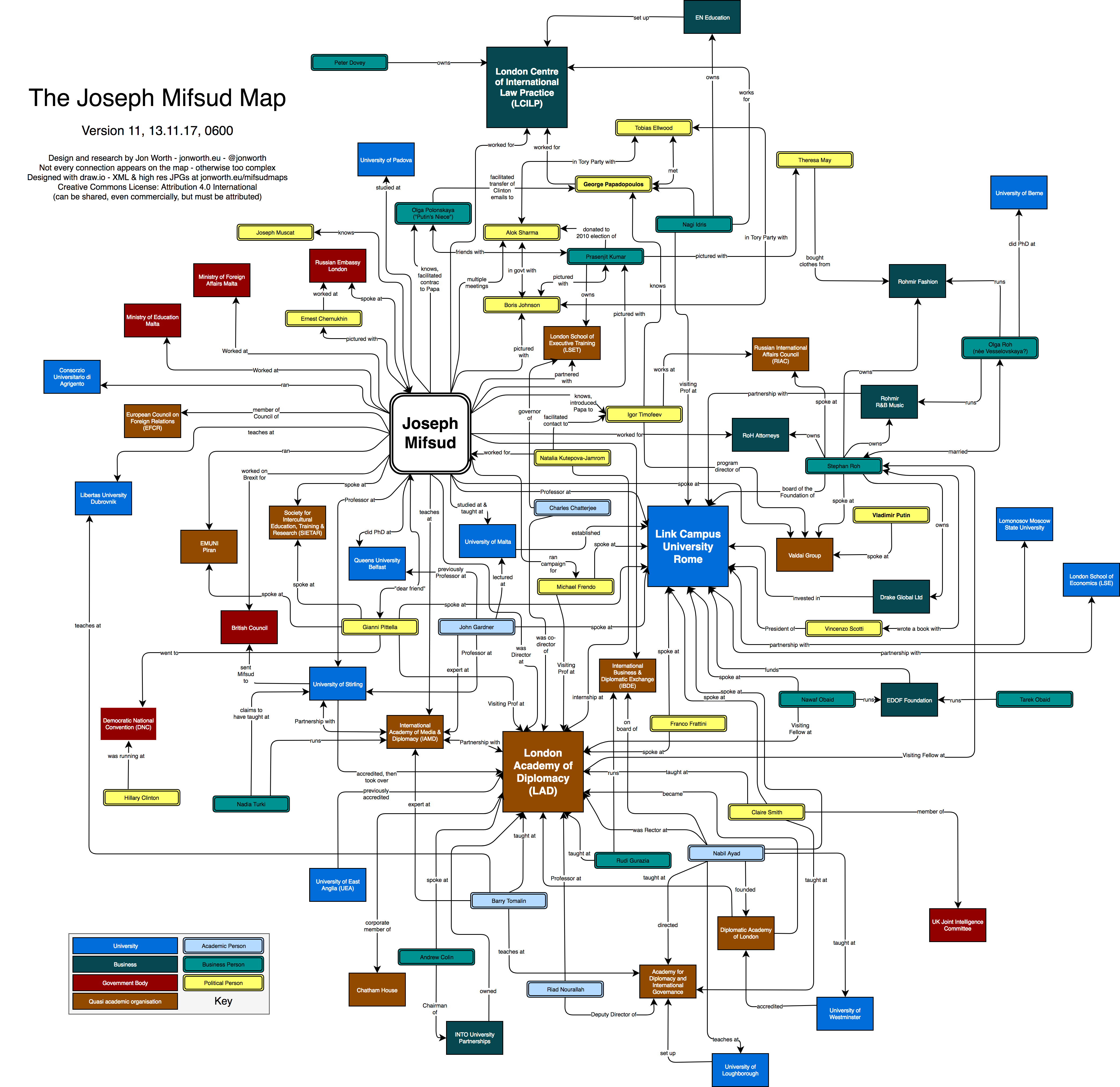
It started back in 2017. I stumbled across the peculiar case of the Maltese Professor Joseph Mifsud, and the web of strange relations he weaved. The best way to map this web was to use a diagram – essentially who was connected to whom. It was with this work I started to use the fantastic tool draw.io to make these diagrams. All of the different versions of the Mifsud diagrams can be found here.
Then in 2019 and through 2020 came the Brexit diagrams – that were in five different series – series 1 (pre-“Meaningful Vote”) and 2 (post-“Meaningful Vote”), series 3 (autumn 2019), series 4 (Brexit and the UK general election), and series 5 (Deal or No Deal Brexit). There is also a blog post about why the diagram method works, and the diagrams were also featured in the New York Times. Diagrams can be downloaded here: series 1 and 2, series 3, series 4, series 5.
The diagrams steadily improved in terms of design, and probabilities were added and included in the design. Series 4 even also incorporated data from betting markets. Here is an example diagram from series 3:

There was also a sarcastic version – BUT FISH! Files here, and this was the only version published – 03.09.2020:

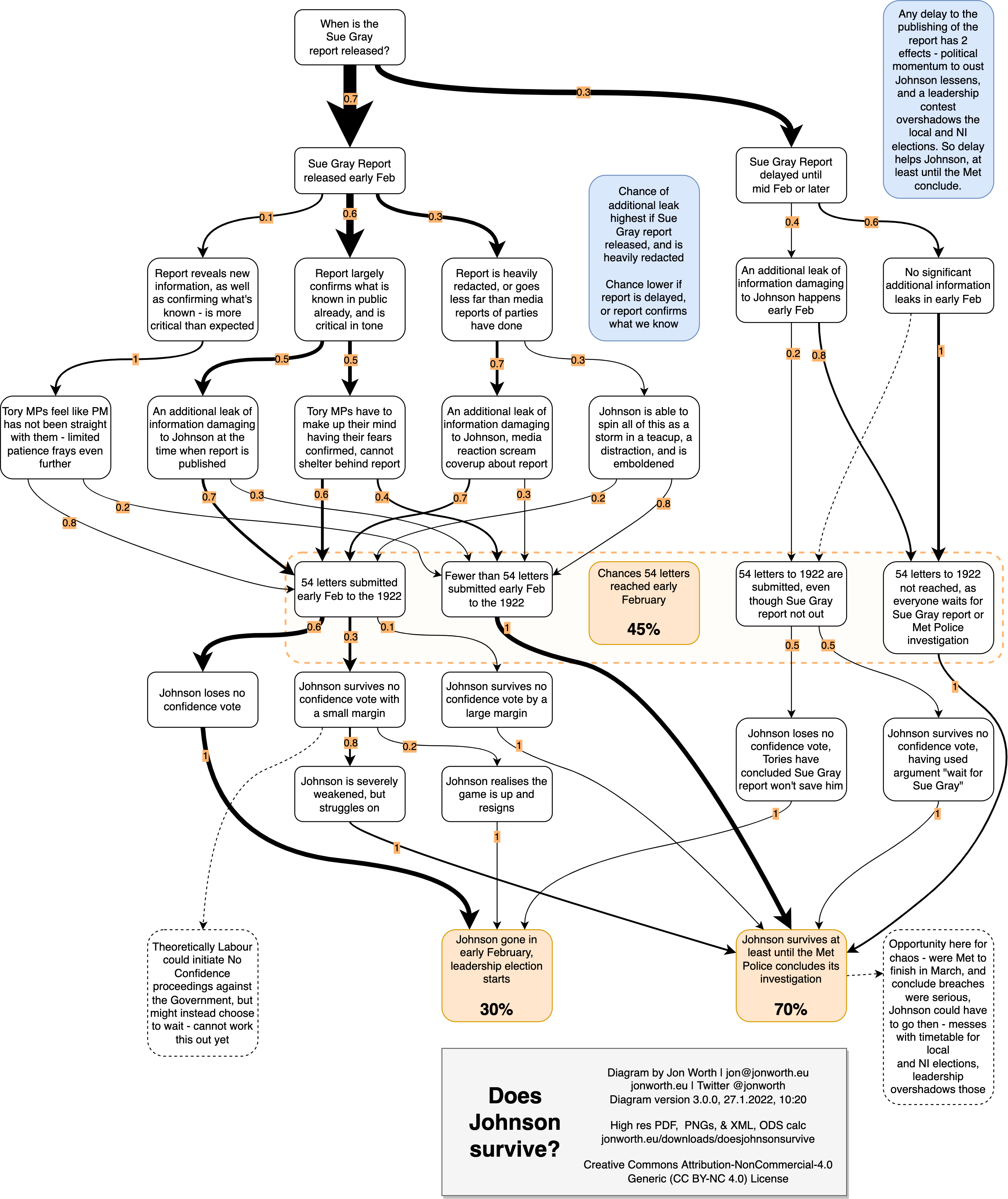
There were two series of diagrams about UK politics not directly connected to Brexit – does Johnson survive the Sue Gray report, and Partygate the early months of 2022? Files here, and the latest diagram dated 28.01.2022:
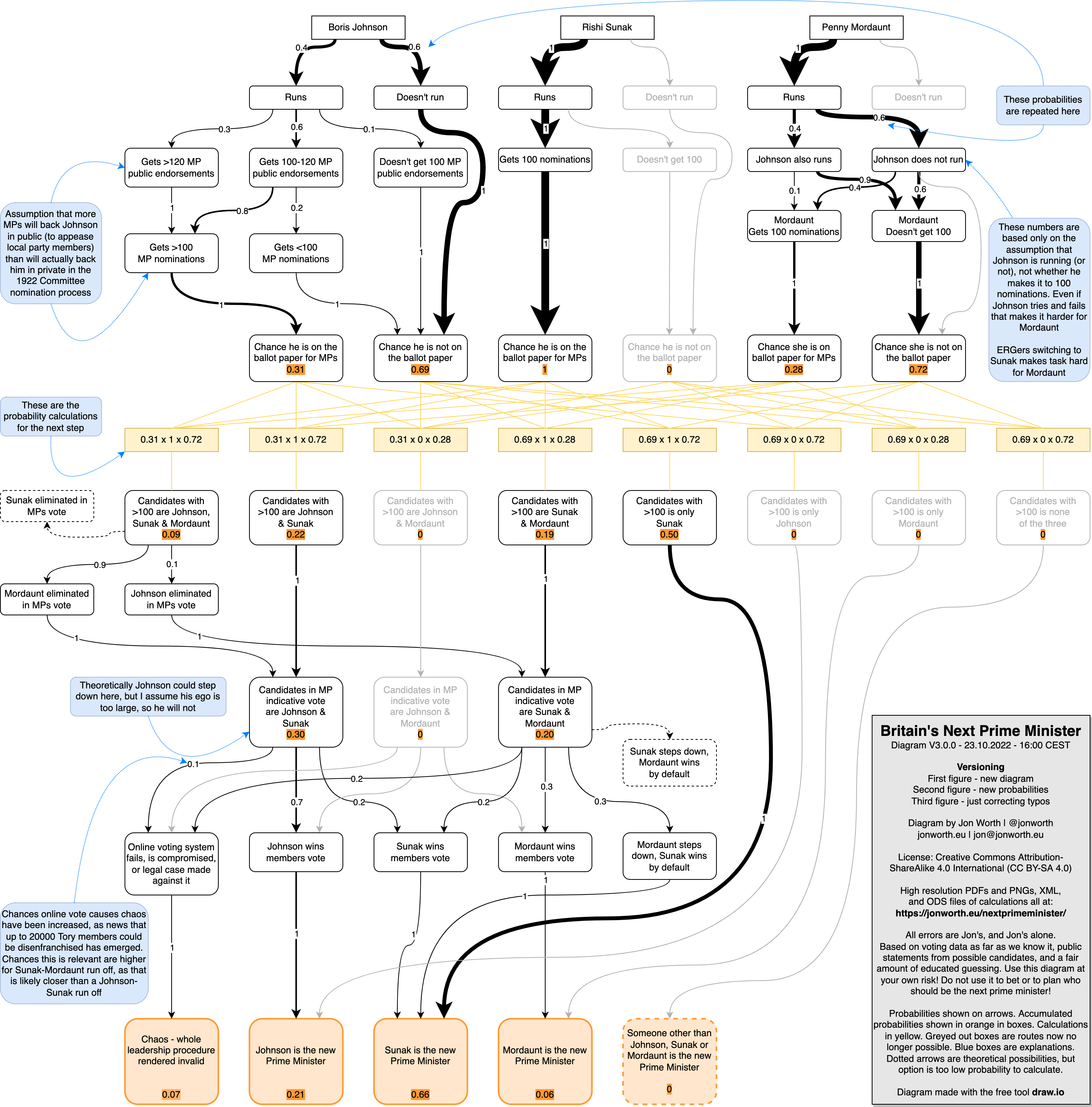
And then later in 2022 I looked at who would succeed Liz Truss, and if Tory members would be consulted. The files are here, and the final version of the diagram published 23.10.2022 is here:
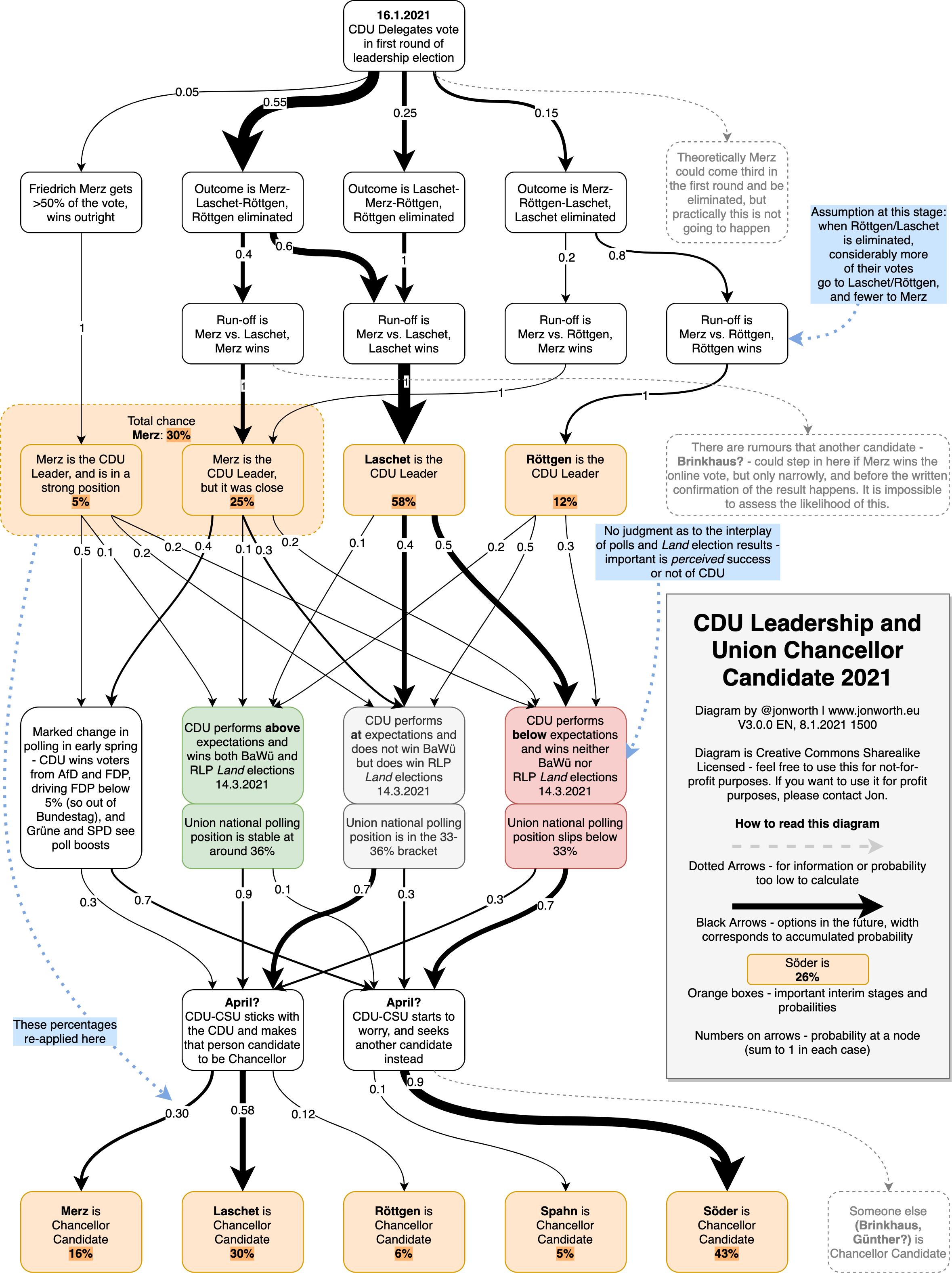
In 2021 I mapped out which Chancellor candidate the German Christian Democrats were likely to choose. The diagrams are explained here, and all the files can be found here. This was the final version of the diagram:
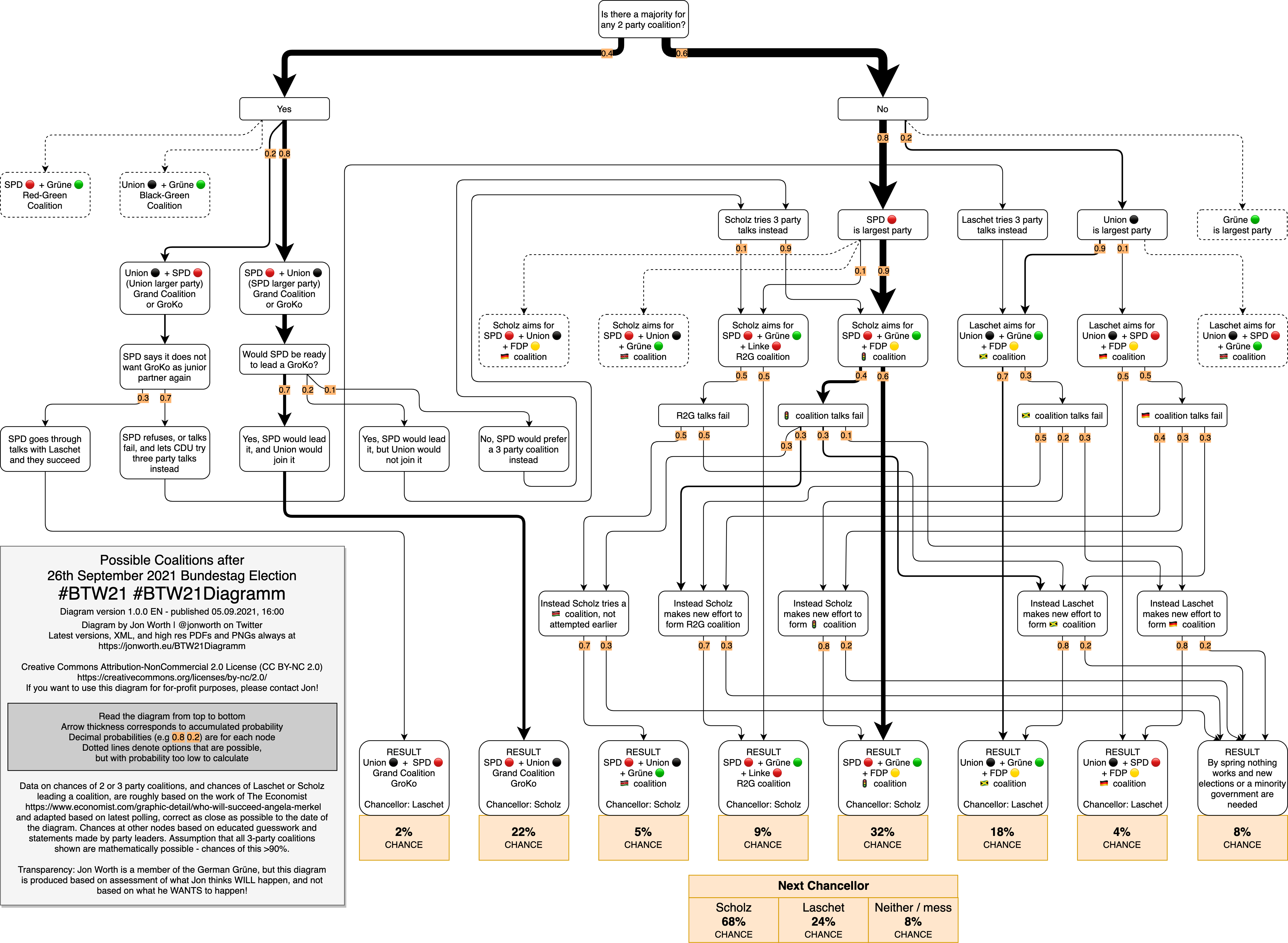
This was followed up with a diagram to predict the outcome of the 2021 Bundestagswahl, who would be Chancellor, and what coalition would emerge post-election. Files here, and the diagram dated 05.09.2021 – and this one totally nailed it!
And then there have been the more minor diagram series…
How to vote tactically at the UK general election – all the files are here, and this was the final version published on 18.11.2019:

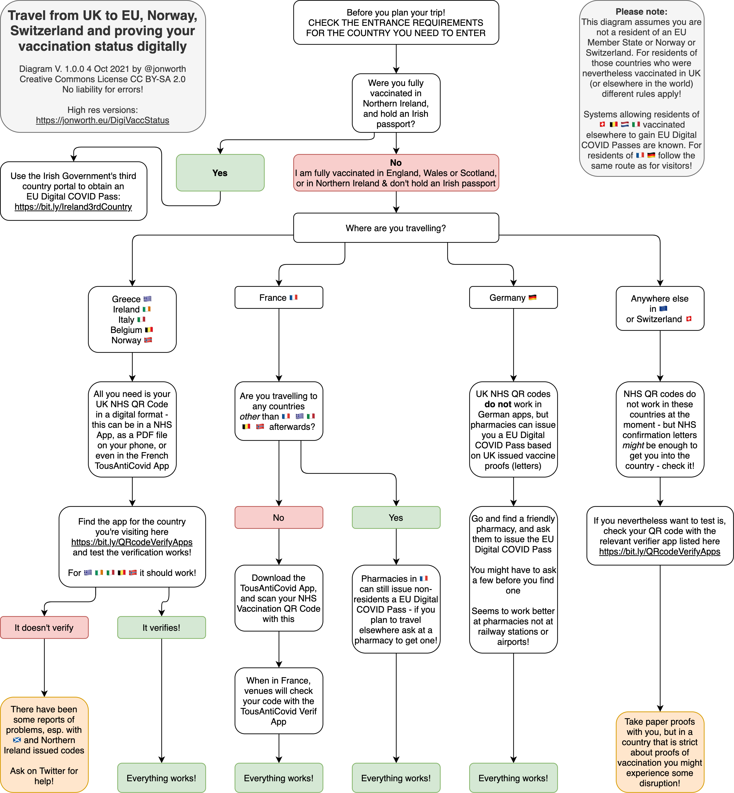
How as someone vaccinated in the UK do you prove that status in the rest of Europe – files here, and published on 04.10.2021:
How to respect social distancing rules in Berlin in the early stages of the COVID pandemic – files here, and published on 18.05.2020:

And a not altogether serious series to explain how to choose a 1. Bundesliga or 2. Bundesliga team to support – files here, from 2020:


And a series of different diagrams about transport…
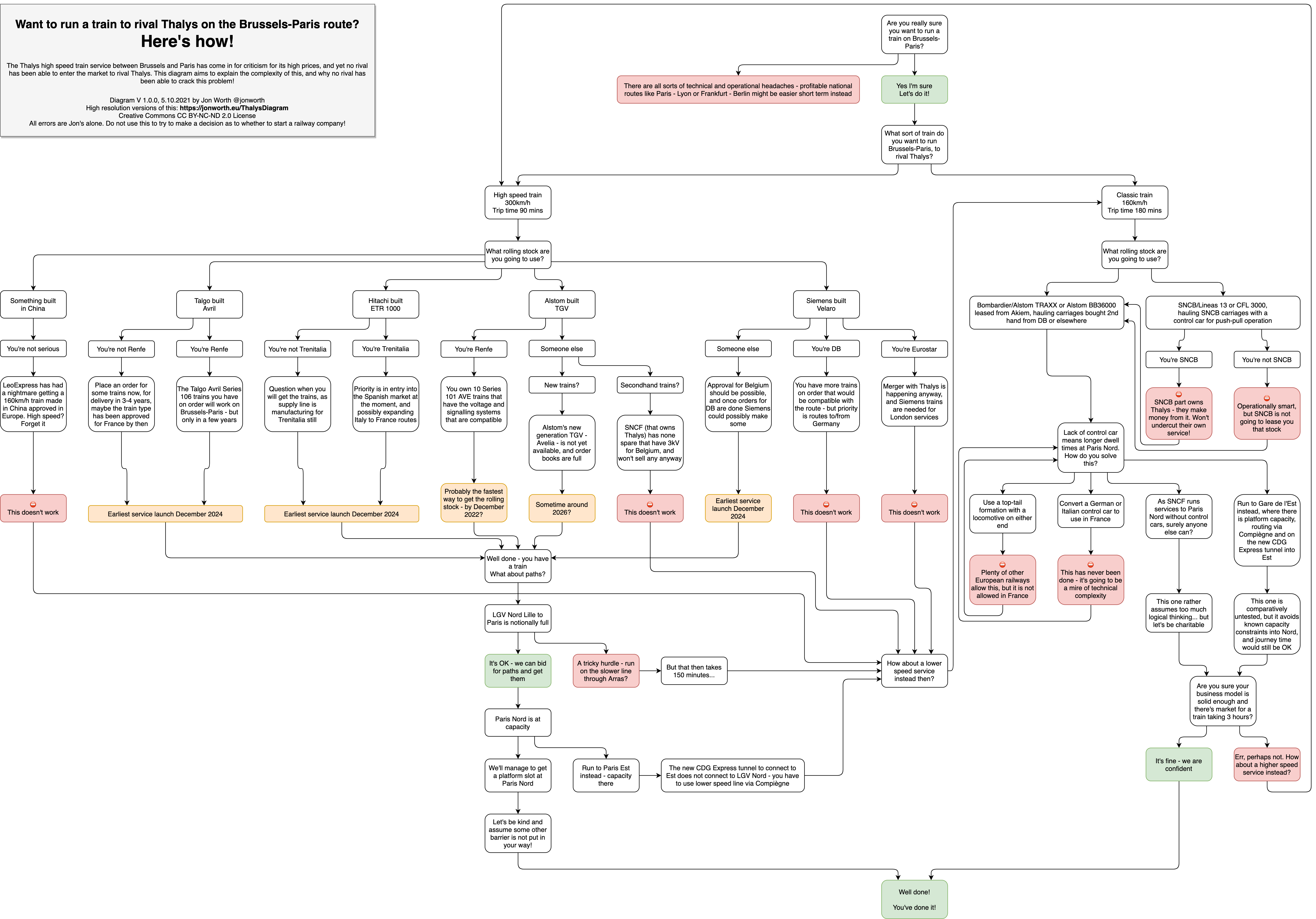
One diagram about trying to run trains to rival Thalys on the Paris-Bruxelles route – files here, and published on 05.10.2021:
How to choose where to run a night train, and how to get it running – files here, and the diagram published 23.01.2020:

Why there will likely never be a night train through the Channel Tunnel – files here, and published on 12.04.2021:
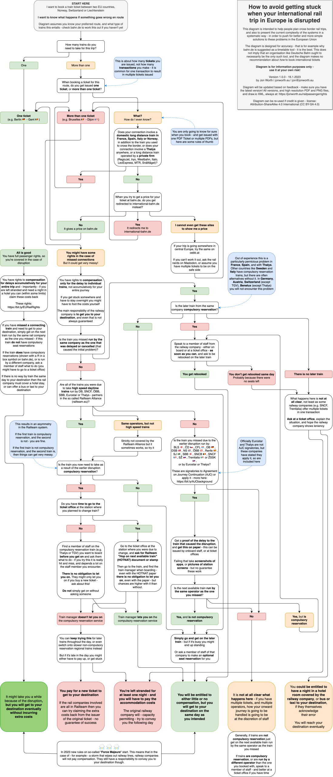
And the most recent railway series – rail passenger rights when travelling internationally by train – as explained in this blog post, all the files here, and version 1.0.0 of the diagram, dated 16.01.2023: