Back in the autumn of last year I did a partial redesign of this blog. Since then the blog has sprouted all kinds of buttons, and looks a bit of a mess. In the meantime WordPress has evolved to version 3.2 and offers a whole bunch of new features. So what, I wonder, are the criteria for the ultimate personal blog in the summer of 2011, and how am I going to change this blog to achieve those aims? Here are my first thoughts.
Feel free to comment on / improve upon the list below!
- Sharing on social media – quick buttons to share content on Twitter, Facebook, Google +1, LinkedIn. The emphasis here is to make sure the design is neat and consistent – the buttons to the left of a post at Mashable are the best I’ve seen. Question is how to make this happen – some combination of plugins and coding from the sites’ own widget systems is going to be the solution I think. E-mail to a friend will be added alongside these buttons.
- Social Media integration – tweets referencing a post will appear below comments on a post (probably using Topsy), and tweets will be referenced in posts using the excellent Twitter Blackbird Pie.
- Publishing to social media – not a blog feature as such, but new blog posts will be auto-tweeted using TwitterFeed, imported into Facebook as Notes, and posted to LinkedIn.
- Mobile and iPad friendly – easy to understand why, perhaps harder to make it work! The simple and free way is to use WPTouch (free version) to create a mobile site, and OnSwipe (free) for an iPad version. The problem is that neither of these plugins gives a very configurable design – worth forking out for WPTouch Pro? Or just stick to the regular site for the iPad?
- E-mail integration – all too easy to overlook in the social media world, but subscribe to post comments and a notification every time something new is posted will be added. This will be done with plugins Post Notification and Subscribe to Comments.
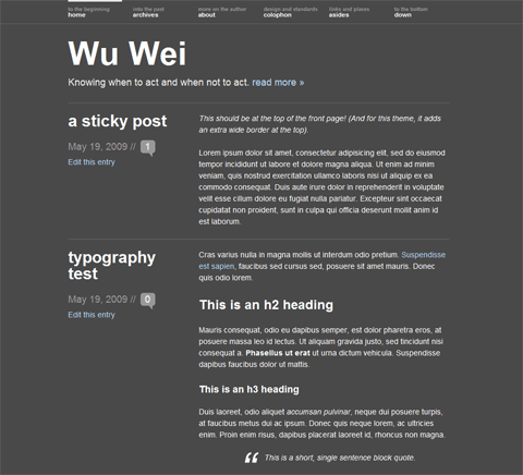
- Design – for the main site this is delicate. The main column of text needs to be 640px wide so as to accommodate Youtube videos, but wider images breaking out of the grid (Wu-Wei style) would also be desirable. Meanwhile a right sidebar design, with a total width of no more than 960px is a must.
- Topics – I have three main topics: EU politics, UK politics and tech Politics. I need to find a way – in a sidebar perhaps? – to draw attention to these issues more closely. Yet I want to keep a traditional blog style homepage, not completely change that in the way Mark Pack has. Some differentiation of sidebars (for blogrolls, links to Twitter lists, perhaps even a link to Google+ Circles?) is also necessary here.
- What I’m writing elsewhere, and what I’m reading – I’m writing more and more for other sites, so the blog needs a way to gather this content in one place. I also read masses of brilliant stuff everyday, and a simple way to present this would be excellent. WordPress 3.2’s Post Formats are probably the best way to accomplish this, although using Delicious would be another option.
- Other odds and ends – an import of where I am currently from Dopplr, latest pics from Flickr, current Klout and PeerIndex status, and clearer pages about what I do also need to be included.
Simple really! 🙂
@MatGB – I’ve looked at the Opera Mini emulator and will try to make sure the blog looks OK with that. Current site looks dire with it… Idea of category feed in sidebar – yes, that’s the sort of thing I will try to do.
@Henning – thanks for the tip, but Social Share is not as configurable as I need. I’m going for a combination of 1 simple FB plugin and some coding instead.
@Karen – smilies are WP default… But they will be neater in the next version.
@Brusselsblogger – new visitors each month is between 50 and 60%. So I agree with you that each page needs to be clear about what I do. Share buttons – my experience is different. I either get many FB shares or, more often, none. Conversely I will almost always get some tweets. Top and bottom – yes, I’ll do that. The tweet a bullet point is indeed innovative, but I don’t think I have that much Twitter activity to make use of that!
A question concerning your visitors: what is the % of new visitors that you get every month? I assume it is over 1/3.
This leads me to the point that I think not only the homepage but also individual articles (where people might land via links/Google) need to explain better what you are doing / you did: most read articles, how to subscribe (email, rss), etc…
On the share buttons: my experience at the moment is that the distrubution is like follows: 80% Facebook, 10% Twitter, 10 % rest. This should be reflected in the button order / layout. The real-time stats on the Mashable buttons are nice but design is a bit clumsy. Also buttons should be at top and bottom of article.
Don’t forget the print button. Think it’s still important – even in 2011.
Finally, one interesting feature I have discovered recently is here: http://blog.kissmetrics.com/science-of-social-timing-3/ Look at the bottom of the article which sums up key points of the post with a direct tweet button next to each statement. I have to say that I found this really innovative.
For a personal blog this could mean maybe that one or two key sentences are highlighted as in quotes. With tweet buttons next to it. Don’t know if there is any WP plugin that would allow this to be more automated.
Ps quite like the onswipe for iPad
PPS not so keen on your current smiley graphics… Look kind of evil (-: but they seem to be the wordpress standard
Are you trying to make it more sexy? As apparently euractiv was trying to do with their site :
http://euroletters.wordpress.com/2011/05/17/euractivs-redesign-can-eu-news-be-sexy/#entry
Anyway looking forward to seeing the finished product! Hoping for user-friendly, easy to read and inter act with. Basically I will be looking for not noticing the tech of the site because it just works and doesn’t seem like it’s trying too much. But that somehow magically all that I could think of wanting to find will be on the page of the site I happen to find myself on.
Try the TF social share plugin. Looks good and I just implemented it on SEJ…
Regarding mobile versions, to me, having been using Opera Mini/Mobile as my efault mobile browser for years now (at least 5, possibly more), the only requirement a site needs to fulfill in making it mobile friendly is to use an @media/screen stylesheet for positioning of elements so that I just get everything in HTML order but with the stylings.
Ideally, of course, the main content should be first in the HTML stream and everything else positioned properly afterwards, and it shouldn’t be relianint onf either JS or Flash to work, but that’s a second order need.
I personally dislike a different, ‘mobile’ version of a site, as it is prone to going wrong, can’t take into account the different capabilities of different phone browsers, and can lead to loss of content. Sites that insist on redirecting me even if I’ve specifically gone to the main site, which I know Opera can handle, are a big bugbear.
Re topics, I kinda like what Mark’s done, but don’t want it for myself, I can see how it’d be useful though. Perhaps a collapsing category feed in a sidebar for the main topics, and emphasis on the category feeds given in both layout and RSS autodiscovery?