The power of the image – reflections on the atheist bus campaign

As things finally start to calm down with the Atheist Bus Campaign in London it’s worth reflecting a bit on some of the aspects of the campaign. I’ll post more reflections here as I begin in my own mind to draw some conclusions from how things developed. I’ll also be presenting the web strategy for the campaign at re:publica ’09 conference in Berlin on 3rd April.
The first lesson to draw is the importance of the images we used throughout the campaign. This was an advertising campaign, and it was about the buses and the bus ads. The whole thing started off with this bus mockup on my blog. When we launched the campaign proper on 23rd October we asked people to submit their own mockups to give a better impression of what our campaign would look like – we received some fabulous work from Base on Mars, R. Longmuir and cbit. When the buses hit the streets we promptly made more than 60 bus pics available for use by journalists (and indeed anyone else) and uploaded more than 60 photos of the launch event with Ariane Sherine, Richard Dawkins and Polly Toynbee. There were also extra high resolution images on the press page of the Atheist Bus site and I was also personally determined that the first public photo of one of the buses would be one of mine.
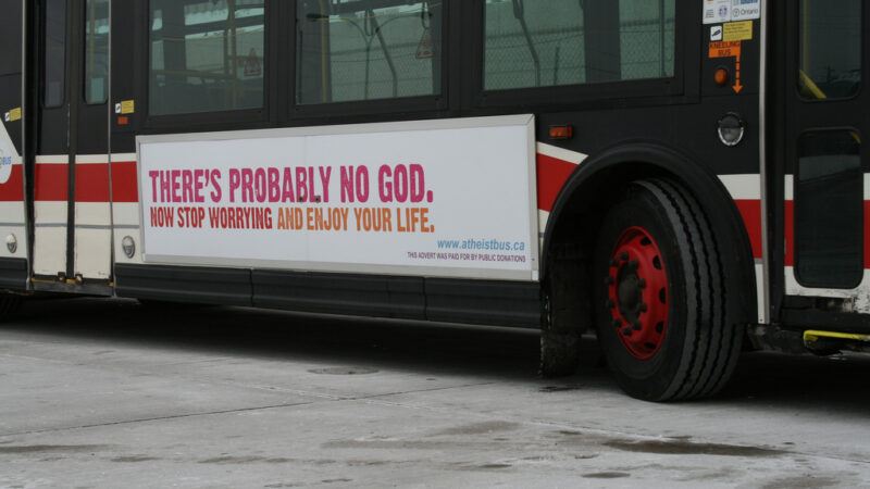
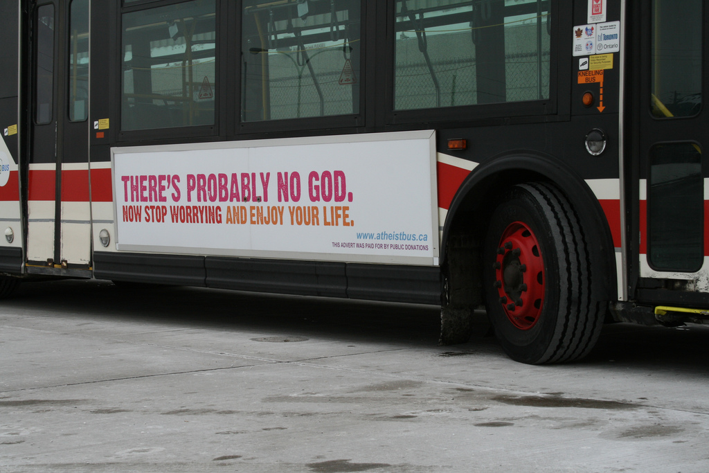
Contrast that with the Canadian atheist bus campaign that is now running (bus and subway ads are already in Toronto). When the first press stories about the Canadian campaign appeared they complained on their website (text subsequently removed!) that the Canadian press was still using the images of the London buses. Well folks, at that stage there were no images at all – not even mockups – of the Candian buses. So no surprise then! There are now some images on Flickr, and one is shown above, but the max resolution for download is still only 1024×768 pixels. The same is now happening with the French language campaign in Montréal – this is the only image I can find of a Montréal bus and that’s not close to adequate quality for anyone to use.
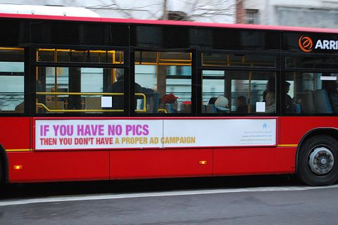
Last but not least the visual aspects have led to some of the most amusing aspects of the campaign, not least the fabulous Bus Slogan Generator (based on a photo I took). So here’s the conclusion to this blog entry, as shown on a bus!


Hi Jon, I stumbled upon this poster once made near the end of WWII: http://news.bbc.co.uk/2/hi/uk_news/magazine/7869458.stm
Don’t get me wrong, but I was struck at how closely it resembled the atheist bus campaign’s slogan in being very dry and pragmatic, but soothing non the less (or maybe just because of it).
From the BBC article about it: “People are drawn to the calming Britishness of the message”
“It speaks to peoples’ personal neuroses. It’s not ideological, it’s not urging people to fight for freedom like some propaganda posters did.”