Labour branding – what’s going on?

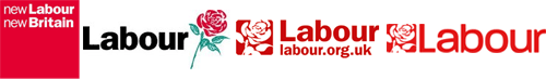
1997 marked the high point. Labour’s brand was strong, the message right for the times. The Mandelson-inspired red square, new Labour, new Britain marked a decisive step forward in UK political marketing – Labour had developed its brand (left image). Things had to become a little more sober from then onwards as Labour entered into a mire of spin; the traditional rose with the new font was the result (second image).
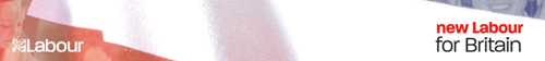
With the impending election of a new leader in 2007, I think the party assumed a new image was required. The third image shown was the result from May through until June this year – a slightly amended rose, but the same font style. When Brown was elected, the logo mysteriously changed to the fourth image shown, using a new font that was the same as the one used for the Gordon Brown for Britain campaign – more rounded and smooth. A new slogan has also appeared – new Labour for Britain – and an accompanying horrible header graphic on the Labour website (shown below).
Something is really wrong here – it is just not acceptable for the imagery of something as important as the Labour Party to be messed about in this way.
[UPDATE – 22.03.08]
If you search for ‘Labour brand guidelines’ in Google UK you end up on this page. Second result is for brand guidelines for Irish Labour – now that’s more like it. Why can’t Labour in the UK learn from Ireland?
Logo text is Paralucent, somehow amended a bit (the top of the ‘b’ is lower than with the normal version of Paralucent)
What font are they using for the text?
mandelson’s logo said ‘we’re Labour and we’re the best.’
the no 2 logo said ‘and we’re up with the dotocm era’
no 3 says ‘CONFIDENCE’.
no 4 says ‘we’re so broad we represent the whole country’
Typical Brown.
This should be his strapline –
‘Think Big. Get Confused’