Mixed messages from the Tories

 What is going on at Tory party conference? I can understand the electoral appeal of trying to move a party to the middle ground, but the Tories seem to be trying to be greener than Labour, all nice and cuddly, and tough and hard nosed too – see David Davis’s comments today about building more prisons, and Oliver Letwin’s statements about the NHS [Sunday Times]. This take on the middle ground seems to be to make statements that are all over the place, and hope that the average in people’s minds is somewhere close to the middle ground. It’s all summed up nicely by this Martin Rowson cartoon, asking what the party members actually think.
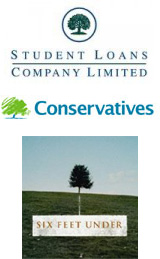
Then there’s the issue of the logo. The Tories now have a sketched oak tree as their logo, which positions them somewhere between the US series about death, 6 Feet Under, and the UK Student Loans company. David Cameron has also launched Webcameron, his slick video-blog. Yet party old timer Norman Tebbitt has slated the rebrand, stating that the new logo looks like a bunch of broccoli.
This all adds up to an image of confusion – what are the Tories, and what do they stand for? Despite Labour’s problems, these criticisms are starting to hit the Tories – a YouGov poll in Saturday’s Telegraph [story here] finds 54% of the population that agree “it is hard to know what the Conservative Party stands for at the moment”.
If only Labour was in a postion to profit from all of this confusion and inconsistency…
I don’t accept that there is anything “hard-nosed” about building more prisons. It’s called putting right a terrible failure. Due to Labour’s failure to match prison places to known and long predicted rises in prisoner numbers we have to put up with a ridiculous set of inappropriate emergency measures (that will probably patch things up for a few weeks – then what?). The reason reoffending rates are at all time highs are because our current prison system is (amongst other things) overcrowded and under-staffed. So your position to paint building more prisons as right wing is ridiculous.
Also, the Letwin noise is just a (disputed) story.
I don’t think Cameron’s videos are slick! Yes, they’re a good idea for putting yourself across, but Cameron’s problem is that we do indeed get to know him better through them – and thereby to realise that he’s a bit of a pillock really. Why can’t he just tell us what he thinks without doing it while loading the dishwasher?
Isn’t Cameron trying to engineer the fight with his right wing so that we all realise that he’s prepared to make the Tory party be something different (ie his ‘clause four moment’?) More encouraging are the polls – the shine seems to be coming off – as indeed it deserves to, from someone who announces that he is “going to use this week to show that he is NOT just style and no substance”…but this will not actually extend as far as publishing a policy on anything.
Arguably, the “rebanding” process was bumpty for the Labour Party, too. When Blair introduced the “New Labour” approach, I’m pretty sure there were people in the party slating the rebrand, and I know there were Labour shadow ministers making left-leaning noises – such as Prescott promising to renationalise the railways, and Short calling for higher income tax – even after Blair had become leader.
So whether Cameron will necessarily allow himself to be turned from his course by the reactionary wing of the party, I doubt, but it probably depends on how the opinion polls work out.
Letwin was in trouble for saying there was no limit to NHS privatisation – which he then denied saying. But it’s only two weeks since our own Patricia Hewitt said pretty much the same thing publicly, though she’s since backtracked a bit (not enough).
Sorry to be negative. But I’m afraid these are arguments we need to have with Labour ministers and not only with Tory would-be ministers.