Map of the US blogosphere – a proper EU blog version would be excellent

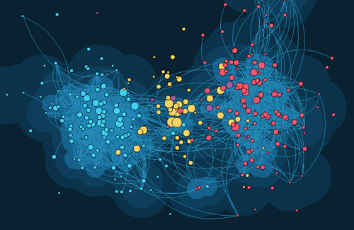
I’ve stumbled across this excellent map of the US political blogosphere (small screenshot above), showing who links to whom and which sites have the highest influence. The colours on the map demonstrate political affiliation. Toute l’Europe has tried something similar for European politics, but to be quite frank they have so many categories that I’m left very confused. Most (but not all) the links on their map are in French. It would be a fun way to look at the Eu blogosphere to create something similar, but as the maps are a commercial venture of Linkfluence I suspect that won’t be happening soon!
[UPDATE -Â 21.03.2008, 1630]
I’ve discovered a Facebook application called Nexus that plots all your Facebook friends on a sort of graph, showing which of them have friends in common. I wonder whether the technology that runs it could be used for mapping which bloggers link to each other? Problem is that I have rather a lot of contacts on Facebook, so the graph is a bit strange!

Thanks for the tip! It looks excellent, but for some reason I can’t make any of their maps work on an Apple computer… Nothing loads in Firefox and Safari crashes. Will have a go on a PC later.
Jon,
Try Touchgraph’s application – it works well for Facebook but also for links between websites using Google searches.
http://www.touchgraph.com/TGGoogleBrowser.html
And it’s free…
@Jon
Your post is very interesting, and I’m always pleased to see our maps actually engaging interested bloggers here and there – by the way I’m VP of linkfluence.
With respect to a map of the EU public opinion websophere, it is something we’ve actually been considering for a while now, feel free to send me an e-mail in order to discuss these topics further.
@Watching Them Watching Us
Just like Matt said, our algorithm only takes into account links made by sites belonging to the same “territory” or community. We see influence as being exerted on certain precise topics or among certain communities and not in general terms. The NYT.com in the US or the Guardian.co.uk in the UK might be deemed influential when it comes to politics or current events for instance, but they are much less so when it comes to motor sports where dedicated media are more influential. Yet, the Guardian has a larger audience that Car magazine in the UK for instance, yet when it comes to certain topics, relevance or peer recognition is more important than reach. The same applies to boingboing. When it comes to the web or new media, it may be very influential, but when it comes to politics, it can only (and it’s a good thing to be sure) reach hundreds of thousands of readers while Dailykos is presumably better at engaging liberal voters. That’s how we construe influence, as a potential of engagement rather than a potential reach in terms of audience. The latter continues to be important in general terms, for traditional forms of offline and online top down communications. For social media, that are more conversational and bottom-up, we believe peer review (or peer linking) is more interesting.
@ MattLeron – the other thing which is not very clear from this map is the direction of linking between sites, or any guesstimate or quantification of the number of links in each direction.
A political blog must surely have far more *influence* if it is being quoted by major mainstream media blogs and press and broadcast journalists, then if it is simply linking to these major news and political comment sources and serving its own small audience. i.e. if the links are from the mainstream media to the blog and not the other way around.
An example of this might be the whistleblower website
Wikileaks.org
http://wikileaks.org
@ MattLeron – a minority of the postings on BoingBoing are “political”, but those that deal with Copyright law, civil liberties, anti-terrorism “security theatre” etc. certainly are very political.
That minority of political posts must surely *influence* far more people than many of the blogs which are stereotyped as being purely political ones, to which the algorithm gives greater prominence on this map, simply due to the large scale of the BoingBoing audience.
The algorithm and the map provide an interesting alternative view of the topic, but the claims that they really represent actual *influence* ratings, seems to be a bit exaggerated.
A metric which I find useful in judging the relative popularity or influence of a particular blog is the number of subscribers to its RSS or Atom syndication feeds via feed aggregation web services like Bloglines or Google Reader. People who are actively subscribed in this way are far more interested and likely to be more deeply influenced by a blog to which they regularly read in this way, than casual “drive by” passive website visitors.
e.g. see “Top UK political blogs”
http://spyblog.org.uk/2006/09/top_uk_political_blogs.html
@Watching Them, Watching Us
Actually, this map is interesting *precisely* because it measures websites’ authority from within the political blogosphere, and not from a ‘worldwide web’ prospective! According to this map, BoingBoing could very well be the leading authority (most linked site) on the global/US blogosphere. But political websites are more likely to link with washingtonpost.com or huffingtonpost.com than with the leading tech blog!
A very interesting map. I’d be interested to see one for the UK too. I suspect the distribution will be very similar.
Hmmm. Making geographic representations is not too hard – there are even WordPress modules to do it. See http://www.barsinbrussels.eu/map/ for example. However that’s not quite what I want to create… I don’t mind too much where people are geographically – I more want to find visual ways to plot sites in terms of importance and political positions (as the US map does). That’s much harder to do technologically speaking.
this is an example of google maps API I was talking about:
http://code.google.com/apis/maps/documentation/examples/geoxml-rss.html
Personally I have tried few months ago an experiment mapping all delegates to the constituent assembly of Italian democratic party (http://mappademocratica.net).
I think the best way would be a technology like google maps (now there is a very interesting public API) and these technologies which maps the web links among the blogs.
This is because there are at least two layer that of the link among politicians and their territory/electorate and that of the links among each politician blog with the others.
You might be right about the problems with the algorithm, but I was interested in the map more in terms of ideas of how to use something similar than what that particular map shows about US politics. It would be possible to use Technorati ranks or something like that instead of their own link analysis system…
The Linkfluence ranking algorithm seems to be quite crude and untrustworthy.
Look at, for example what is acknowledged by every other measure of the blogosphere to be a worldwide “top 10” ranked blog like http://www.boingboing.net, with tens of thousands of subscribers to their syndication feeds.
According to this map it has no links and the smallest size of dot i.e. the least sort of traffic or influence, which must be completely wrong.
Indeed, they did a great job. Isn’t there a way to find a good free mapping software to map the European Blogosphere?