Presidency logos, a retrospective (now updated with new logos!)
The product of the finest consultancies, art schools and messy governmental compromises within national governments – each and every Presidency of the Council of the European Union feels it needs its own logo. So to mark the release of the French logo for 2008, here’s a retrospective of logos past…
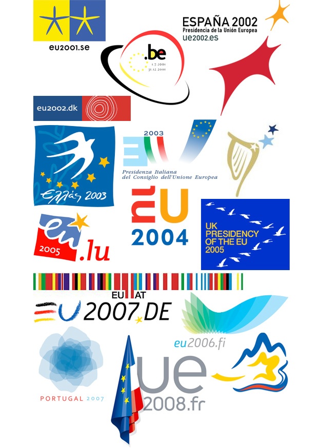
- Sweden 2001 – simple stars in the Swedish and EU colours. My score: 3/5
- Belgium 2001 – a Magritte hat, and the .be font is used on Belgian government branding to this day. 4/5
- Spain 2002 – Spanish colours, vaguely in star shapes. Looks somehow modern. 3/5
- Denmark 2002 – smart colours, and the logo fitted a sober and smart Presidency. 4/5
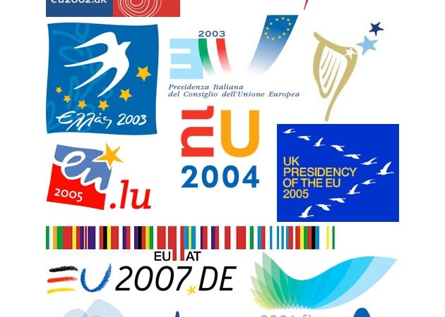
- Greece 2003 – innocent and inoffensive. 2/5
- Italy 2003 – what’s going on here? The E is also facing backwards, symbolic for Berlusconi messing up the Constitution IGC during this Presidency. 1/5
- Ireland 2004 – harp is a bit overdone as the Irish symbol, and pastel shades are weak. 2/5
- Netherlands 2004 – the clever EU-NL thing in the logo could not make up for the coarse juxtaposition of colours and blocky fonts for this Presidency. 2/5
- Luxembourg 2005 – another attempt to be clever with the eu/lu in the logo. Less tough on the eye than the Dutch efforts. 3/5
- UK 2005 – nice idea, birds flying in tandem to show teamwork. Problem is that birds poo on your head, and bird flu hit during the Presidency, prompting this spoof logo. 2/5
- Austria 2006 – the hope was that bringing in Rem Koolhas to design a logo would give the Presidency a bit of a boost. I’m unconvinced. 3/5
- Finland 2006 – a story of ‘the green of a burgeoning forest, the sweep of the horizon and the blue of water shimmering in the sun’ according to the Presidency website. Smart and sober. 4/5
- Germany 2007 – hand drawn letters to make the EU seem less harsh, but the logo itself is a disappointment. It did appear on some pleasant umbrellas that you still see around Brussels. 2/5
- Portugal 2007 – an aesthetically pleasing effort, but what does this say about the EU as a series of overlapping cooperations? Beware the political implications of logos. 3/5
- Slovenia 2008 – contains the obligatory Triglav, and there’s a twee story about fire, earth, water, air and ether on the Presidency website. But don’t think too long about the logo. 2/5
- France 2008 – has caused some consternation because the EU flag is larger than the French flag (although I’m OK with that) but the logo is smart and contemporary. 3/5
Yes, OK, before anyone mentions it in the comments: I do wonder about the merits of spending cash on these logos. But when a country has the Presidency, especially if it’s a small country, a degree of national pride ensures to make sure everything runs smoothly, and the branding is a part of that.
Sorry, there are no polls available at the moment.UPDATE 1.1.2014: Following a debate on Twitter, I have now updated this post with all the newer logos!
Not sure this post is still curated, but I’d like to know Jon’s take on the’new’ Dutch logo…
Thanks for the good lauch! My favourite is still the Spanish one, but I’m not objective. Funilly enough I don’t like the same ones as you. For example, I really disliked the French one – too conventionnal and heavy – and don’t understand the Danish one…
I guess the appreciation of beauty is very culture-related. Besides shapes and colours mean different things in different cultures, which makes the logo choice all the more tricky.
Although I like the Greek one best, I really liked how the Austrians implemented their barcode in all possible communication situations, too!
I voted for Italy as they only had one vote and I felt a bit sorry for them.
Erm, I wasn’t so sure this post was going to produce such a following! There are also some logos pre-2001 that could be added and I’ll try to add the later ones too.
Thank-you so much for the compilation. I’ve been looking for something similar for ages! Hope you manage to keep it updated.
Nice collection, good idea!
I like “Greece 2003” best.
and BTW to me the Spanish logo represents a bull running after a star… you know, Spaniards always breaking up stereotypes 🙁
you all know that I am not too much of a fan of the SLO Presidency logo, but on the other side of the Alps they found some enthusiasts… don’t you see a clear influence on the Football Eurocup one? http://www.euro2008.uefa.com/
Triglav again 🙂
The ‘barcode’ was designed by Koolhaas as part of his design for a European capital in 2001 (supposed to be the flag) and was also used in an exhibition on Europe in 2004 during the Dutch presidency. I rather like it. It’s one of the few showcases of original thinking on the design of the European Union.