How a little Norwegian school results map could give Ed Miliband some ideas
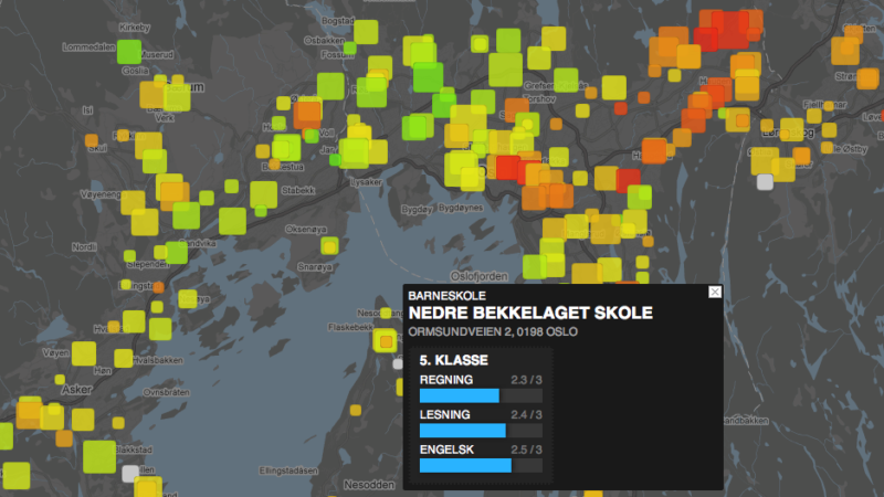
The idea is simple, the map is stylish and easy to read, and the code is open source – welcome to skoleporten, the interactive map of Norwegian school results for junior schools (5th grade) and secondary schools (8th grade), produced by Evan Westvang, one of the programmers at Origo.no. More details on the Origo blog in Norwegian here. Sizes of squares represents size of schools, and colour represents how well they’re doing.
So what’s the significance of this for Ed Miliband and Labour (hence the title of the blog post)?
As government cuts start to bite Labour is going to be overloaded by stats – reductions in the number of police, inadequate numbers of teachers recruited etc. Some of these stats will be official numbers, others could be crowd-sourced impressions. Yet the danger is that Labour’s front bench team just spews out these numbers, into the never ending back and forth of the Westminster political game.

But how does it impact me as a citizen? My police station, the school down the road, the school across the borough that happens to be in a Tory controlled ward? For this Labour needs good and simple web tools – similar in style to skoleporten – to explain what’s happening, to make the reality of the cuts clear for everyone to understand. It’s not as if the data is not available – see the BBC’s school results search for example – but visualisation of the data is vital too.
One more thing. A UK site you have earlier mentioned is relevant in this context: http://schooloscope.com/ (someone reminded me about it in the comment section at Origo-bloggen http://bit.ly/9qXJ6t)
Similar to the Norwegian map, it compares test results, has colour codes and you can either find schools on the map or search for them.
@Jack – thanks for the link, not sure how I haven’t seen that, but Googling ‘UK cuts map’ doesn’t get to it (see this). It’s not yet as visually clear as the Norwegian map, but it’s a very good start!
http://wherearethecuts.org/
I’m glad you’re spreading the idea of the Norwegian school test map that my colleague, Even Westvang has created, Jon! The interesting thing about this map is that it is based on data from 2008, the dataset from 2009 and 2010 are not made available (yet). The Norwegian newspaper Dagbladet.no used FOIA to get hold of the dataset from 2008, but so far, no one has been able to get access to the latest dataset, except on a council/municipality level, not individual schools. So we have some more work to do in order to update the map…
I’ve also read articles in Norwegian media (http://www.nrk.no/nyheter/1.6442316) about how some politicians, teachers and students want to get rid of the ranking of schools, based on the results. They are afraid of the loser tag. I think openness around the results, also on individual schools, is a good thing. In the long run, it will encourage/force them to improve.
Another and bigger question is the quality of the national tests and how they are shaping the teaching, the teachers and the students….
Even referred to this book in his blog post: http://www.amazon.com/Death-Great-American-School-System/dp/0465014917 (written by Diane Ravitch, American education historian)